Pursuing Intention Through Safety & Simplicity
INTRODUCTION
My design philosophy is focused on work that improves quality of life by reducing risk, preserving clarity, and supporting people in their everyday interactions with systems and tools. I tend to approach design through a systems lens, shaped by my background in healthcare where dependable processes are critical for patient safety and risk reduction. Healthcare has been a constant presence in my life, with multiple family members working as registered nurses locally and abroad. My ancestry also informs my perspective—my great-great-grandfather was among the early Filipino physicians trained in Spain, and his son later became a grassroots leader in my hometown of Iloilo. During times of instability, they represented reliability and service to their community, reinforcing my commitment to designing a product or system that conveys safety, trust, and connection.
From my interaction inventory, I identified six guiding principles that structure how I evaluate design: design for risk reduction, preserve mental bandwidth, support flow through reliability, embed visual simplicity, design with contextual awareness, and prioritize meaningful impact over feature accumulation. Together, these principles emphasize clarity under pressure, reduction of unnecessary friction, and responsiveness to human and environmental constraints. I treat design as an intentional discipline: anticipating edge cases, reducing opportunities for error, and structuring predictable product or system behavior so users can build trust. Personally, visual appeal matters only when it supports usability rather than competing with it. My overarching goal is to design products and systems that feel stable and reliable, particularly in contexts where attention is constrained or stakes are high.
Part 1: Interaction Inventory
iPad (9th Generation)
I use my iPad daily for reading, reviewing notes, and watching video content because it consolidates books and media into a single, portable device. Due to a chronic shoulder issue, avoiding physical inventory is important to me, so the ability to download and access content on-demand reduces both weight and logistical burden. Hence portability without added physical strain is a critical design feature in how I evaluate this device.
I use my iPad daily for reading, reviewing notes, and watching video content because it consolidates books and media into a single, portable device. Due to a chronic shoulder issue, avoiding physical inventory is important to me, so the ability to download and access content on-demand reduces both weight and logistical burden. Hence portability without added physical strain is a critical design feature in how I evaluate this device.
Apple Pencil (1st Generation)
I use the Apple Pencil to handwrite notes and mark up readings on my iPad because it lets me work the way I think without adding physical clutter. What works well is how responsive and precise it feels, plus being able to switch colors and tools instantly without breaking my flow. What frustrates me is when palm rejection fails or connection issues interrupt writing because it breaks my focus and flow state. Reliability is important to me when it comes to physical tools that integrate into digital technology, and I get frustrated when it behaves inconsistently.
I use the Apple Pencil to handwrite notes and mark up readings on my iPad because it lets me work the way I think without adding physical clutter. What works well is how responsive and precise it feels, plus being able to switch colors and tools instantly without breaking my flow. What frustrates me is when palm rejection fails or connection issues interrupt writing because it breaks my focus and flow state. Reliability is important to me when it comes to physical tools that integrate into digital technology, and I get frustrated when it behaves inconsistently.
Hatch Restore 3
I use the Hatch as a part of my daily bedtime routine because it supports my circadian rhythm and healthy habits I’ve made for myself. I have developed insomnia due to working the night shift over the years, so it's difficult for me to fall asleep since I don’t have a regular sleep schedule. The ambient sounds and sensory light functions support my easing into sleep, and help mimic night time for me if I worked the previous night and need to sleep. What I don’t like about the product is that I have to subscribe to a subscription model to have access to their light and sound library, which is a frustration point.
I use the Hatch as a part of my daily bedtime routine because it supports my circadian rhythm and healthy habits I’ve made for myself. I have developed insomnia due to working the night shift over the years, so it's difficult for me to fall asleep since I don’t have a regular sleep schedule. The ambient sounds and sensory light functions support my easing into sleep, and help mimic night time for me if I worked the previous night and need to sleep. What I don’t like about the product is that I have to subscribe to a subscription model to have access to their light and sound library, which is a frustration point.
Microsoft To Do
I use this as both a lifestyle and work management tool across several personal devices — mobile, desktop, iPad, and laptop — and because it's accessible online regardless of the device you’re on, it sets itself apart from other work management tools. Its simple UI (e.g., the single input field on the first screen) reduces cognitive load for me. I live by my calendar and daily task list — so the less clutter, ambiguous icons, and non-essential features visible on the screen in front of me, the better. However, my pain point with this application is that I have to log in through Microsoft, which requires several actions, such as logging in using Microsoft Authenticator and needing to check my phone for the OTP.
I use this as both a lifestyle and work management tool across several personal devices — mobile, desktop, iPad, and laptop — and because it's accessible online regardless of the device you’re on, it sets itself apart from other work management tools. Its simple UI (e.g., the single input field on the first screen) reduces cognitive load for me. I live by my calendar and daily task list — so the less clutter, ambiguous icons, and non-essential features visible on the screen in front of me, the better. However, my pain point with this application is that I have to log in through Microsoft, which requires several actions, such as logging in using Microsoft Authenticator and needing to check my phone for the OTP.
Philips Intellivue MX40 Box
I physically interact with and troubleshoot this medical device throughout twelve-hour shifts, three times a week, as it is central to my patient monitoring responsibilities and to the workflow of adjacent clinical staff such as CNAs, nurses, and physicians. The telemetry box is a critical component of an in-patient monitoring system that supports patient safety and risk reduction by continuously tracking cardiac rhythm and heart rate, identifying abnormal patterns that inform the patient’s plan of care (POC). A major friction point, however, lies in its interface: both the physical and on-screen buttons require excessive pressure and repeated attempts to register inputs, creating unnecessary physical and cognitive effort in a high-stakes clinical environment.
I physically interact with and troubleshoot this medical device throughout twelve-hour shifts, three times a week, as it is central to my patient monitoring responsibilities and to the workflow of adjacent clinical staff such as CNAs, nurses, and physicians. The telemetry box is a critical component of an in-patient monitoring system that supports patient safety and risk reduction by continuously tracking cardiac rhythm and heart rate, identifying abnormal patterns that inform the patient’s plan of care (POC). A major friction point, however, lies in its interface: both the physical and on-screen buttons require excessive pressure and repeated attempts to register inputs, creating unnecessary physical and cognitive effort in a high-stakes clinical environment.
Part 2: Personal Design Principles
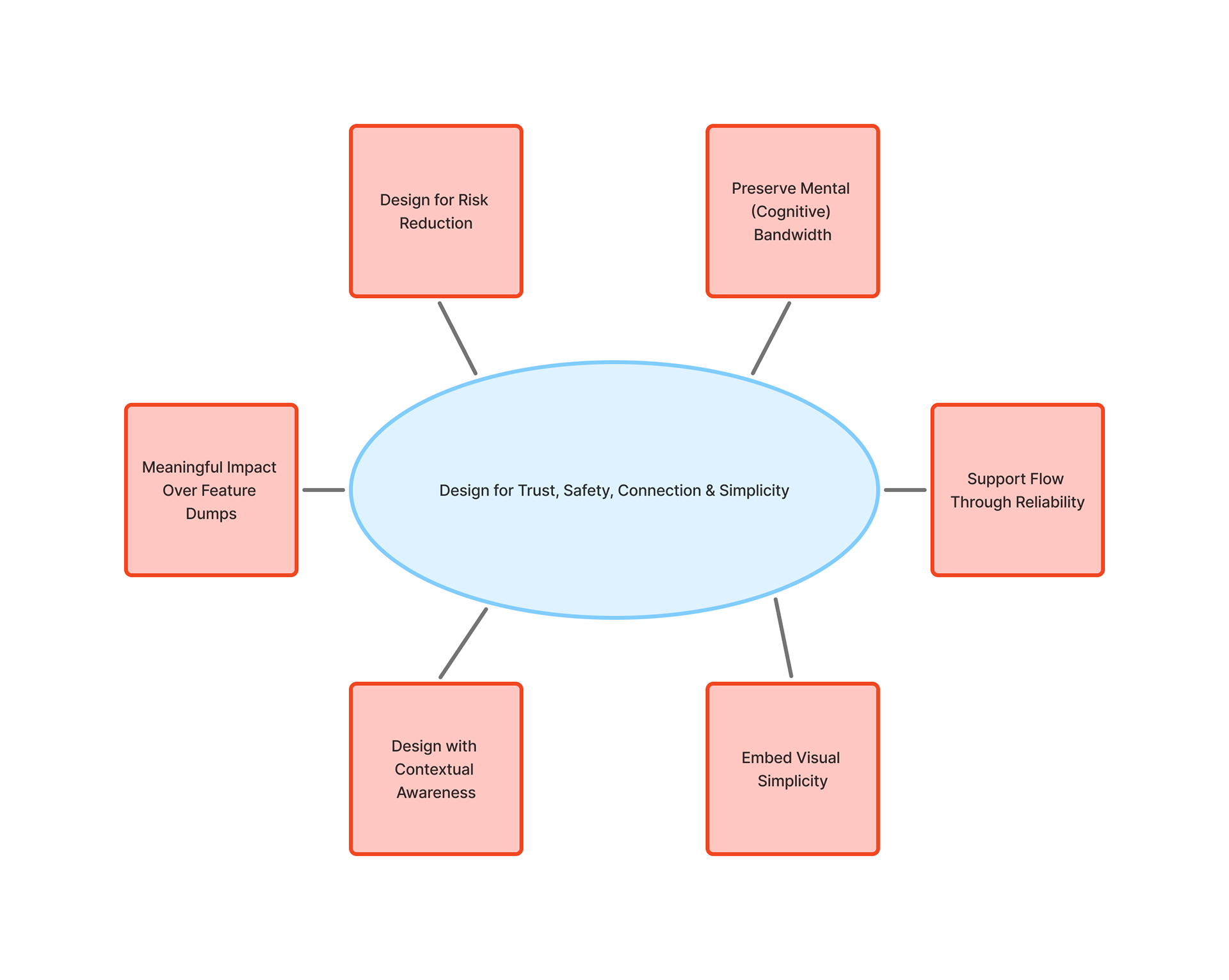
Fig 1. Visual diagram of my 6 Design Princples
1. Design for Risk Reduction
Design should proactively reduce the likelihood of error, especially in safety-critical environments. The Philips telemetry box requires excessive pressure and repeated attempts to register input, which weakens feedback and increases the potential for misinterpretation during urgent tasks. In lower-risk contexts, the Hatch Restore 3 reduces physiological stress by staging light and sound transitions rather than introducing abrupt alarms. This principle extends Norman’s emphasis on feedback and error prevention: physical and digital interfaces must clearly confirm action and reduce unnecessary disruption (Norman, 2013).
Design should proactively reduce the likelihood of error, especially in safety-critical environments. The Philips telemetry box requires excessive pressure and repeated attempts to register input, which weakens feedback and increases the potential for misinterpretation during urgent tasks. In lower-risk contexts, the Hatch Restore 3 reduces physiological stress by staging light and sound transitions rather than introducing abrupt alarms. This principle extends Norman’s emphasis on feedback and error prevention: physical and digital interfaces must clearly confirm action and reduce unnecessary disruption (Norman, 2013).
2. Preserve Mental Bandwidth
I think good design minimizes avoidable micro-decisions so users can focus on meaningful tasks. Microsoft To Do reduces visual clutter through a single primary input field, supporting rapid task capture. Like the Hatch Restore 3, once routines are configured, no additional decisions are required, enabling a quicker transition into my sleep routine. Consistent with Hick’s Law, decision time increases as the number of choices grows, strongly suggesting the importance of limiting unnecessary options in interface design (Hartson & Pyla, 2018).
I think good design minimizes avoidable micro-decisions so users can focus on meaningful tasks. Microsoft To Do reduces visual clutter through a single primary input field, supporting rapid task capture. Like the Hatch Restore 3, once routines are configured, no additional decisions are required, enabling a quicker transition into my sleep routine. Consistent with Hick’s Law, decision time increases as the number of choices grows, strongly suggesting the importance of limiting unnecessary options in interface design (Hartson & Pyla, 2018).
3. Support Flow through Reliability
Design must protect momentum. When the Apple Pencil responds precisely, it supports uninterrupted note-taking. When palm rejection fails, cognitive flow breaks. Likewise, when the telemetry box fails to register input clearly, workflow efficiency suffers. Nielsen’s principle of efficiency of use reinforces that experienced users should not encounter friction in repeated tasks (Nielsen Norman Group, 2020).
Design must protect momentum. When the Apple Pencil responds precisely, it supports uninterrupted note-taking. When palm rejection fails, cognitive flow breaks. Likewise, when the telemetry box fails to register input clearly, workflow efficiency suffers. Nielsen’s principle of efficiency of use reinforces that experienced users should not encounter friction in repeated tasks (Nielsen Norman Group, 2020).
4. Embed Visual Simplicity
Simplicity is structural clarity, not aesthetic reduction. The iPad consolidates multiple physical artifacts into one device, reducing burden while maintaining access. The Hatch Restore 3 similarly limits exposed controls, structuring interaction through predictable routines rather than complex surface features. Drawing from Gestalt principles, organized structure reduces perceptual strain (Lauer & Pentak, 2016).
Simplicity is structural clarity, not aesthetic reduction. The iPad consolidates multiple physical artifacts into one device, reducing burden while maintaining access. The Hatch Restore 3 similarly limits exposed controls, structuring interaction through predictable routines rather than complex surface features. Drawing from Gestalt principles, organized structure reduces perceptual strain (Lauer & Pentak, 2016).
5. Design with Contextual Awareness
Design should reflect the environment in which it operates. The telemetry box functions in high-stakes clinical settings where speed and clarity are critical. Requiring excessive force contradicts that context. The Hatch Restore 3, by contrast, is designed for a sleep environment and adapts its sensory output accordingly. Products should feel natural to use, and systems should respond to environmental demands rather than forcing users to compensate (Norman, 2013).
Design should reflect the environment in which it operates. The telemetry box functions in high-stakes clinical settings where speed and clarity are critical. Requiring excessive force contradicts that context. The Hatch Restore 3, by contrast, is designed for a sleep environment and adapts its sensory output accordingly. Products should feel natural to use, and systems should respond to environmental demands rather than forcing users to compensate (Norman, 2013).
6. Meaningful Impact Over Feature Dumps
Design should prioritize real-world improvement over added complexity. The iPad reduces physical strain by replacing multiple books, and the telemetry box supports patient safety through continuous monitoring. The Hatch Restore 3 improves sleep behavior through controlled light and sound rather than feature overload. This principle echoes Rams’ assertion that good design is purposeful and restrained (Rams, 2012).
Design should prioritize real-world improvement over added complexity. The iPad reduces physical strain by replacing multiple books, and the telemetry box supports patient safety through continuous monitoring. The Hatch Restore 3 improves sleep behavior through controlled light and sound rather than feature overload. This principle echoes Rams’ assertion that good design is purposeful and restrained (Rams, 2012).
Part 3: Case Studies
Case Study A: Beloved Object
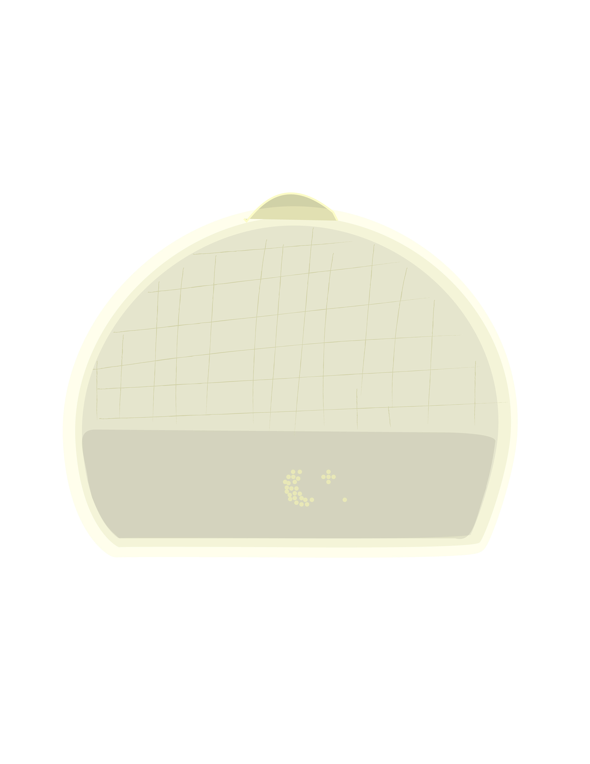
Fig 2. As shown in this vector illustration, the device’s central button on top of its rounded form signals to the user where
Hatch Restore 3
I use the Hatch Restore 3 daily as part of my wind-down and wake-up routine. What I appreciate most is that it doesn’t rely on sudden alarms. Instead, the physical device gradually increases light and sound, slowly transitioning the user into wakefulness. That behavior feels intentional, rather than reactive.
The Hatch reflects my principle of Design for Risk Reduction because it reduces physiological shock. A traditional alarm introduces sudden auditory stress. The Restore instead stages the transition from sleep to awake, which aligns with Norman’s emphasis on predictable feedback and clear system behavior (Norman, 2013). It also supports Preserve Cognitive Bandwidth. Once routines are set in the connected app, there are no nightly decisions to make. I do not have to select sounds or adjust brightness each evening. Light and sound cues are also customizable. The interaction is constrained and repeatable. That constraint is not limiting; it reduces friction.
Finally, it demonstrates Embed Simplicity, Not Minimalism. The physical device has limited visible controls. The primary interaction happens through structured routines rather than exposed buttons. Its restraint is functional. The form supports the function without adding surface-level complexity. There is only a singular, physical button located on top of the device, which is used to turn up the volume or turn on the light function. It is a natural signal that is naturally interpreted, requiring no labels — demonstrating Norman’s ideas of visibility and affordance (Norman, 2013).
The Hatch Restore 3 works because it integrates behavioral routine, sensory design, and physical simplicity into a sensory experience and cohesive system.
Case Study B: Problematic Design
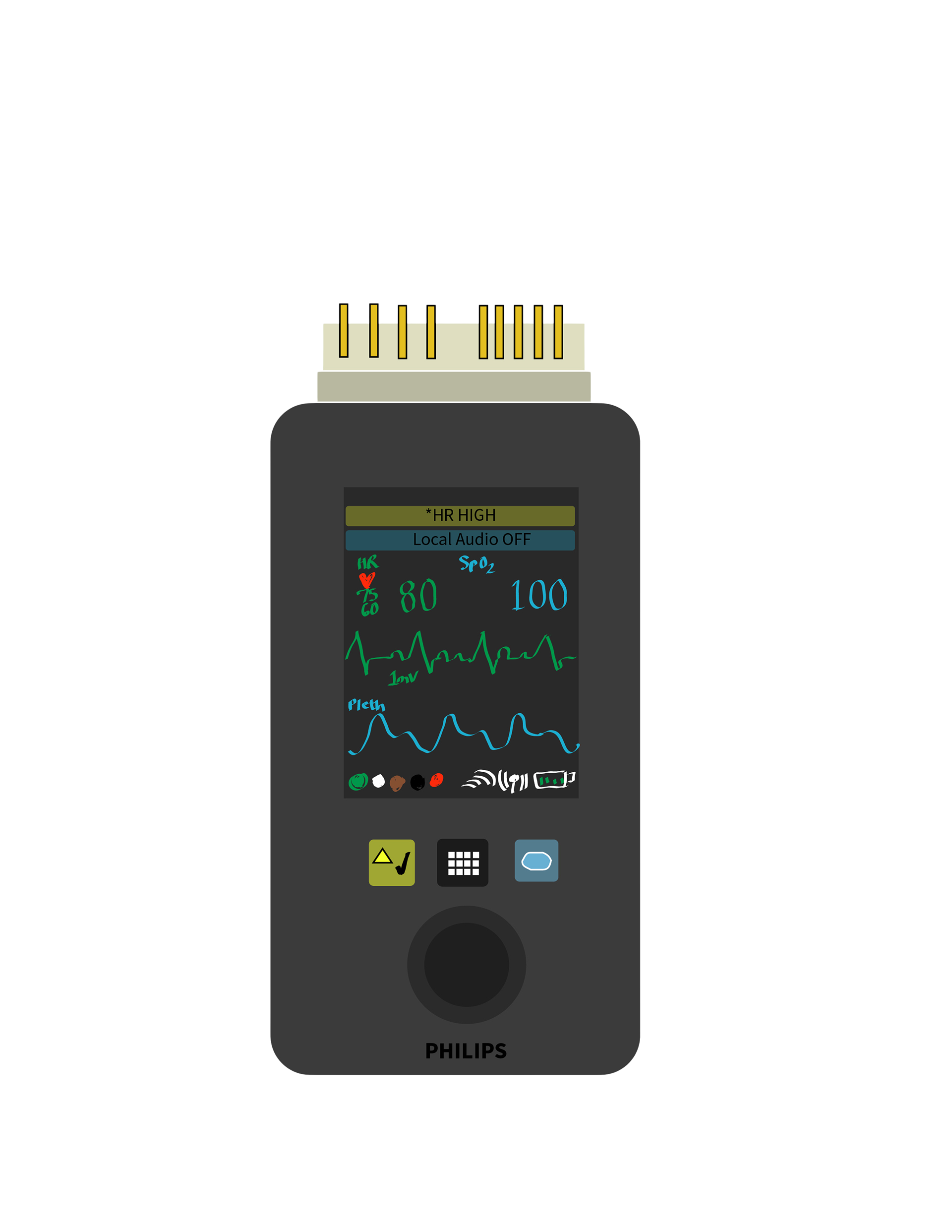
Fig 3. Vector line drawing of the Philips Intellivue MX40 Box made using Adobe Illustrator
Philips Telemetry Box
The Philips telemetry box is a physical, portable transmitter used in-hospital to continuously monitor patient cardiac rhythms and oxygen saturations. I interacted with it repeatedly during twelve-hour shifts. Its function is critical, but the physical interaction introduces friction. There is a clear mismatch between the device’s intended affordances and the realities of high-pressure clinical use.
The device violates my principle of Support Flow Through Reliability. Buttons require excessive pressure and sometimes repeated attempts before registering input. This slows action and competes with attention, and in a clinical environment where time sensitivity is critical, hesitation carries meaningful risk. It also conflicts with Design for Risk Reduction. In safety-critical environments, input confirmation should be immediate and unambiguous. Weak tactile feedback creates uncertainty about whether an action has been completed, and that uncertainty can increase cognitive strain.
Additionally, the device lacks Contextual Awareness. It operates in environments where efficiency and clarity are essential, yet the interaction design demands focused effort. The physical resistance does not reflect the urgency of its context.
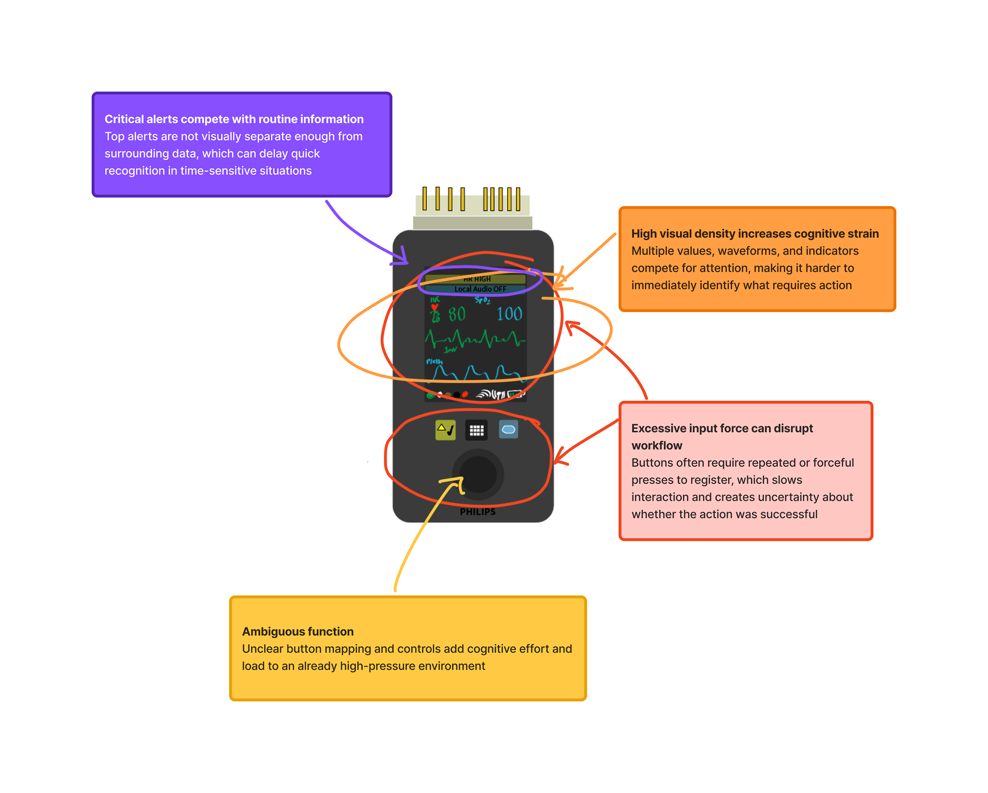
Fig 4. Annotations of the MX40 UI
Suggestions for Improvement:
- Reduce required input force for button activation
- Reduce required input force for button activation
- Provide clearer confirmation feedback (a clear, distinct tactile or auditory cue)
- Improve ergonomic placement of controls for quick access and to reduce friction
- Consolidate visible controls into those most frequently used in routine clinical tasks
Even small improvements in button responsiveness would align the device more closely with my design principles.
ConclusioN
In hindsight, this assignment helped to clarify that my understanding of design is rooted in prevention rather than reaction. Analyzing the objects and systems I interact with frequently revealed a pattern in how I evaluate design: I notice friction quickly, especially when it interferes with workflow, clarity, or trust. The telemetry box highlighted how small interaction failures can increase cognitive strain in high-stakes environments, while the Hatch Restore 3 demonstrated how intentional constraints can reduce stress and support behavioral stability. Even tools like the iPad, Microsoft To Do, and the Apple Pencil reinforced that reliability and simplicity are not aesthetic preferences for me. They are structural requirements.
Developing my six principles forced me to move from observation to abstraction. Risk reduction, preservation of mental bandwidth, flow through reliability, visual simplicity, contextual awareness, and meaningful impact are not intended to be isolated ideas; together, they describe what I perceive is responsible design. I am most attentive to products and systems operating under pressure, where predictability and clarity protect attention. This process also made me more conscious of design drift, especially how easily decisions can shift toward novelty or personal preference instead of user need.
Going forward, I want to ground my approach to design in a disciplined practice focused on stability, restraint, and contextual sensitivity. Whether in healthcare environments or other complex systems, I am motivated by the idea that good design should reduce invisible strain. If a product or system is structured with empathetic intention, a user should not have to compensate for it. That is the standard I intend to design towards in my work.
References
Hartson, R., & Pyla, P. S. (2018). The UX book: Agile UX design for a quality user experience (2nd ed.). Morgan Kaufmann.
Lauer, D. A., & Pentak, S. (2016). Design basics (9th ed.). Cengage Learning.
Nielsen Norman Group. (2020). 10 usability heuristics for user interface design. https://www.nngroup.com/articles/ten-usability-heuristics/
Norman, D. A. (2013). The Design of Everyday Things (Revised and expanded ed.). Basic Books.
Rams, D. (2012). Less and more: The design ethos of Dieter Rams. Gestalten.